PULSE DJ + Live Music
PULSE DJ + Live Music
ROL
Interface Designer
TIMELINE
July 2019
TOOLS
Figma, Adobe Illustrator
TEAM
Solo Project
OVERVIEW
PULSE DJ is a music creation and performance app designed specifically for multi-touch table surfaces. The guiding principle was MODERN & INSPIRING — a simple interface that promotes creativity rather than interrupting it. Every design decision was made to reduce cognitive load so musicians could focus entirely on making music, not navigating UI.
THE CHALLENGE
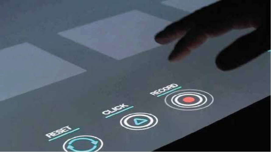
Multi-touch tables are non-standard surfaces. Most UI patterns from desktop or mobile do not translate — gestures are different, scale is different, and the physical interaction context (a horizontal surface, often shared, often in performance environments) demands fundamentally different design thinking.
The challenge was to build an interface powerful enough for professional use but intuitive enough for amateurs — across a surface most designers have never designed for.
PROCESS
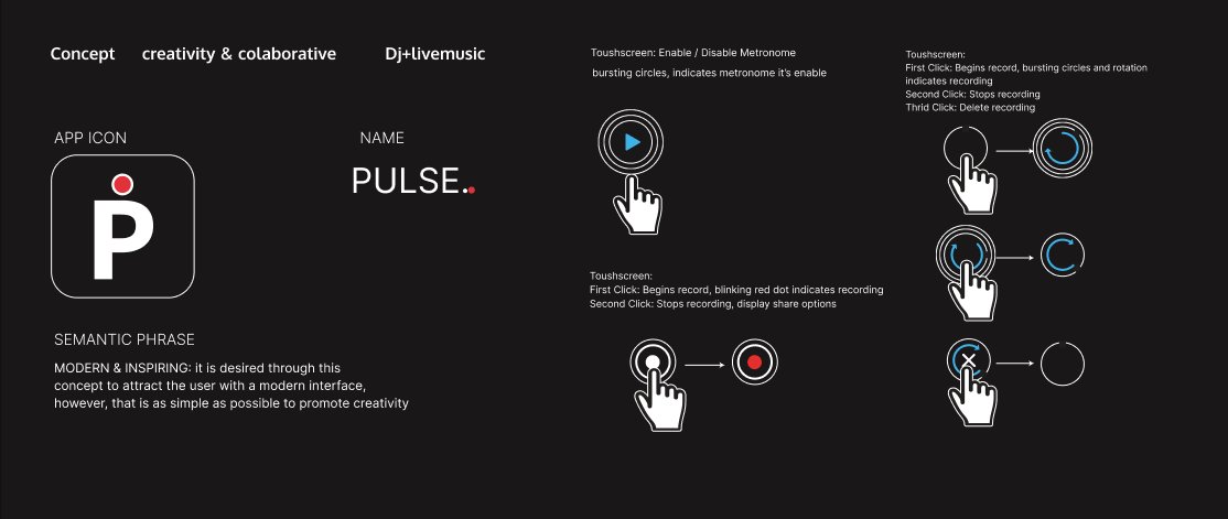
01 Concept & Semantic Brief
Defined MODERN & INSPIRING as the guiding design principle. Every visual and interaction decision was measured against it.
02 Custom Iconography System
Every icon designed from scratch. Instruments, controls, loops, recording states — all custom. Consistency and recognizability across a non-standard form factor required icons that worked at multiple sizes and orientations.
03 Interface Architecture
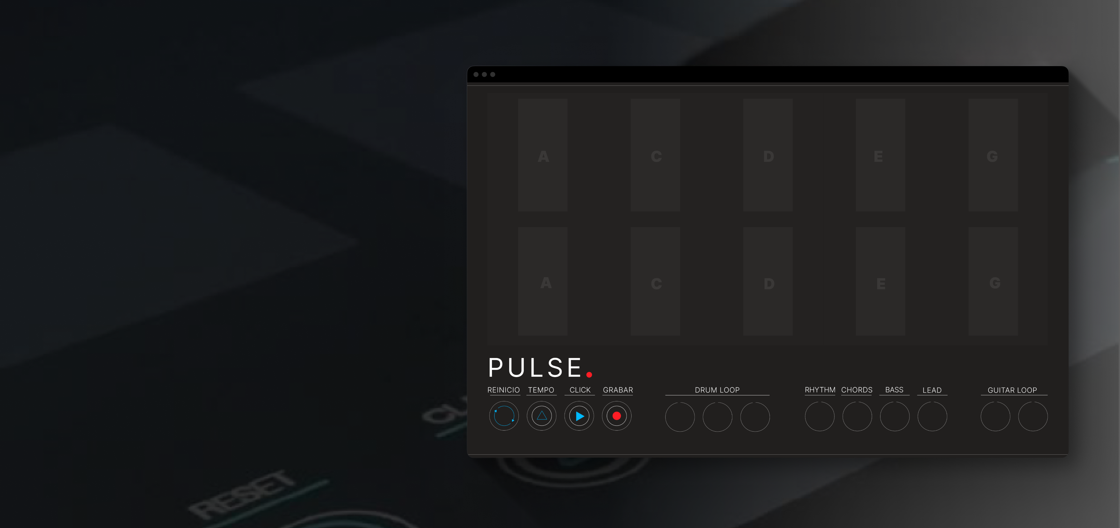
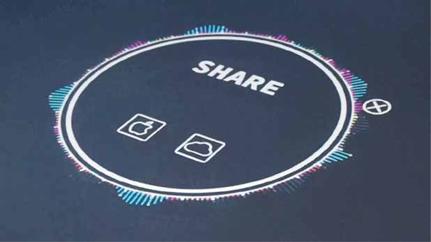
One primary action always visible. Seven independent track layers with clear visual hierarchy. Recording flow across three states: armed, recording, reviewing.
ICONOGRAPHY
The iconography system was the backbone of the interface. With no standard library available for multi-touch music interfaces, every icon was drawn from a clean grid — instruments (drums, bass, synth, samples), transport controls (play, pause, record, stop), loop visualization states, and recording flow indicators.
Consistency across categories was maintained through a shared visual language: uniform stroke weights, rounded terminals, and a unified optical center for all glyphs.
OUTCOMES
Demonstrated that a complex multi-touch music interface could be both powerful for professionals and approachable for amateurs. The project became a formative reference for understanding interaction design beyond standard screen paradigms — and for thinking about how surface type fundamentally shapes interaction vocabulary.
WHAT WE LEARNED
A good interface for a musician disappears. If they are thinking about the UI, the UI failed.
Designing for non-standard surfaces forces first-principles thinking. Without existing patterns to fall back on, every decision requires deeper justification — which ultimately produces better, more intentional design.
Siguiente Proyecto
BA Banner Generator